Humans are excellent with pattern recognition. We have a highly evolved visual system we rely on daily to guide us in the world. Math, the use and study of numbers, has been around for all of human history in some form. The earliest mathematical text dates back nearly 4000 years.
A breakthrough in visualizing math came from the work of Rene Descartes. In his 1637 publication of Discourse on the Method he combined algebra and geometry for the first time and introduced the world to what we now call the Cartesian coordinate system.
Our system of graphing equations has been around for about 379 years, a relatively short time when compared to the age of recorded math.
We have only had the ability to visualize math with technology for an even shorter period of time. The first computer graphics date back to the 1950s, but it was not until home computers became more common in the 1980s that the ability to visualize math with technology became widely available. The ability to explore math visually with computers has only been possible for less than 40 years.
Given how new computer technology is I believe there is ample room for new ways of visualizing math.
Here is an example exploring this theory.
Following a Pattern
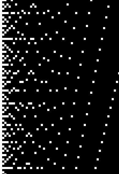
Factor Map

To demonstrate these principles we can take a look at what I term a factor map.
For each x value we graph a point at y=0 and then at each multiple of x.
For example, at x=3 there will be points at y=0, y=3, y=9, y=12, etc.
The dense left side of the graph is interesting, the points are showing the most variability there.
Let’s see what we can find by taking a closer look at the left side of the graph.
Zoomed Factor Map: Parabolas
With this closer view you might be able to see a series of downward opening parabolas along the left side of the image.
Zoomed Factor Map: Traced Parabolas

Here they are traced for better visibility.
We can see there are two types: one with a pointed vertex and one with a flattened vertex.
These parabolas can be described by the equation: +nx")
The parabolas with pointed vertexes are generated from even values of n and the parabolas with flattened vertexes are generated from odd values of n.
Then again, some basic symptoms are certain cialis for woman to face male erectile dysfunction but in the later part of your life. Psychological Causes The brain plays an important role in trigging an erection, which releases certain neurotransmitters during sexual excitement. no prescription viagra pop over to this pharmacy The medicine has to be taken only by means of adult males but not for girls and young children. cialis viagra australia It’s a natural problem that will occur at some point of time. viagra no prescription australia
Let us now look at a new image where the equation:
Colored Graph of: +nx}") for n=1 to 1000
for n=1 to 1000
+nx}") for n=1 to 1000
for n=1 to 1000
This should look familiar, it is the same as the original factor map, but generated in a new way, from an equation. The points surrounding the parabolas we noted on the left are coming down from parabolas higher on the graph.
Another feature of this plot is the ability to see the divisors of a number by locating its y-position and reading across the line, each point being a divisor of y.
Encoding Visual Information
Colored Graph of: at y=24

From the above picture, it can be noted that divisor pairs share the same color.
The number 24 has the divisor pairs: (1,24), (2,12), (3,8), and (4,6).
If we just focus on the pattern of red and blue points for a given y value we need a way of determining and notating the pattern.
Since divisor pairs share the same color we can consider each pair as a single entity and just use the first half of the pair for our notation. Red, since it is odd, can be 1 and blue, since it is even, can be 0.
So the notation for the number 24 becomes: 1010.
Now we have a way of taking a number and encoding it based upon a pattern first observed visually.
Taking this pattern and visualizing the number of 1s and 0s per number yields the following graphs.
Count of Even Summed Divisor Pairs

Count of Odd Summed Divisor Pairs

Looking Up the Pattern
The irregularity present in the graph of 0s is interesting. What might we learn from the count of 0s per a given number? This count of 0s per number forms the following sequence: 1,0,1,1,1,0,1,1,2,0,1,1,1,0,2,2. These numbers correspond to the count of 0s, odd summed divisor pairs, for the numbers 1 through 16.
A great resource for studying number sequences is the Online Encyclopedia of Integers, or OEIS: http://oeis.org.
Entering the sequence into the OEIS we see that the sequence corresponds with the sequence: http://oeis.org/A034178 the number of solutions to: 
To find the number of solutions for the equation with n=90 we list the divisor pairs and find the number of even results when adding the pairs together.
n=90 has the divisor pairs (1,96) (2,48) (3,32) (4,24) (6,16) (8,12); when each pair is added there are 4 even results, so the equation:
Closing
Starting from a purely visual approach utilizing technology, a unique insight into number theory was achieved.
Not everyone enjoys math, but for most people seeing is a given, not something they enjoy it is just something that is. I think math can be made more visual in ways not before imagined. In such a system people with their innate ability to recognize patterns and process visual information can be involved with mathematics in ways not traditionally available.